
Silhouettes and shapes
tell the viewer where to look
Don't ever doubt the power of a simple shape to influence the viewer. We look at things that interest us, and nothing draws the eye better than a familiar object. Add a person to a landscape and you tell the viewer to "look at me." Painting a bright spot on a dark canvas also says to pay attention to this spot. And the converse is also true; a dark area on a light canvas draws our attention.
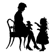
And it's also true for interesting shapes, complex shapes, and colorful shapes. But it's the familiar shape that really rules. In this example, we know what we're looking at: a mother and daughter, and something like a teddy bear. There's also a fancy chair.
Note that the silhouettes are separated so that we can see their identifying features. If we looked from a different angle, we might just see a meaningless blob.
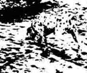
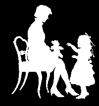
If we look at a negative image, we can still identify the shapes. No problem.
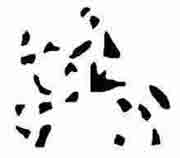
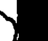
Here's where it gets touchy. If you don't have enough of the image to key the viewer's brain, you may end up with a puzzle. What is this?
Or this?
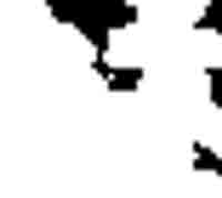
If there's not quite enough there, we don't have a frame of reference. In these two examples, should we be looking at the light or dark areas? In the first example, the subject is black. In the second example, the subject is white.
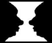
And what's worse, if the light and dark areas are about equal in area, we don't have any idea what to look at. In the image below, do you see a bat or an open mouth with teeth?
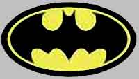
This Batman logo was planned with about 50% light and 50% dark areas, so we'd see two different things. You probably don't want to do this with your art. You want to force the viewer to "look at me."
More books and other things from Amazon. Just click this link: